I'm a graphic designer who creates items for marketing / advertising / branding / identity, such as books, brochures, flyers, logos, identity guides, stationery, websites (design only, not development), ads, catalogues, reports, posters, exhibition walls, t-shirts, stickers, signage, coffee cups... the list goes on and on. It's not work, it's play! I've been in the design game since 1996 and running my own business since 2001. I love it!
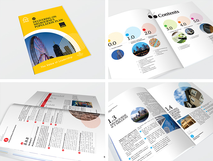
I shared the initial design concepts with Mike Signal (Artichoke Design). We wanted to create more of a magazine feel to the book, rather than each page follow a strict template. So while there would be a style to follow so that every page looks like it belongs in this book, every double page spread would be unique in it’s layout which would create more interest. Once the design concept was approved, I then completed designing the rest of the book (a further 70 pages) and I also took care of the finished art. (Note: I do graphic design work for the Property Council of Australia through Artichoke Design.)
In 2016 the Property Council decided to update their website and give it a fresh look and so they asked me to do the same to all of the reports, covers and forms that I create for them. The result is a fresh, cleaner, more corporate look that is still in use today. (Note: the text in the reports shown has been replaced with dummy text and graphs have been altered, as the actual information is confidential.) (Note: I do graphic design work for the Property Council of Australia through Artichoke Design.)
Fresh, bright, clean, 20 page brochure for an immigration business.
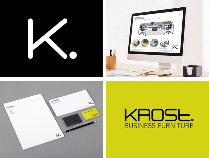
While working on a new design for their catalogue, I quietly snuck in a new logo. I wanted something more modern and something that made more of a statement than their existing logo – something that said “we’re here.” Putting a fullstop after the word Krost worked. It then followed on to simply use K on it’s own, also with a fullstop. They approved the new logo and so I then set about creating the style guide, including stationery, magazine advertising, website home page and vehicle signage. (Note: I did this graphic design work for Krost through Nineteen Ninety Nine Designs.)
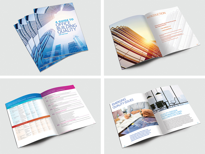
It was time to update the Guide again – always happy to give my own work a face lift and improve it. The Guide looks clean, fresh and easy to read. (Note: some text has been replaced with dummy text as the actual information is confidential.) (Note: I do graphic design work for the Property Council of Australia through Artichoke Design.)
Don't forget to say you found them on
OzLance.
