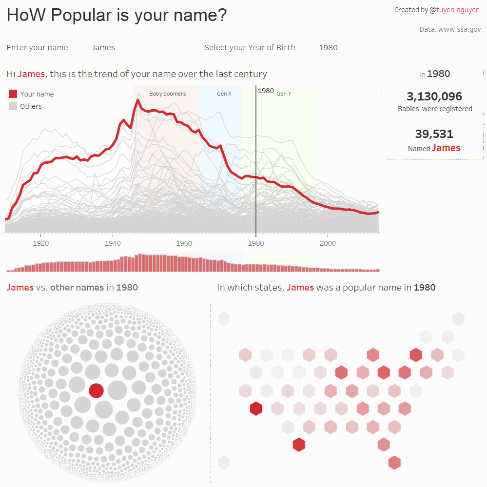
The dashboard enables the audience to find out what is the popularity of their name in the US, drilling down to the year of birth and their states.
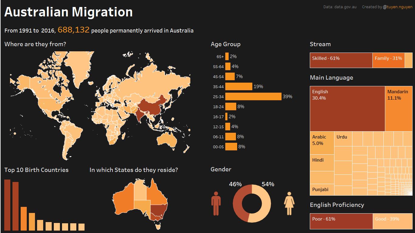
Australian Migration Dashboard
A dashboard built in Tableau to display migrations in Australia that enables audiences to answer such questions as "where are they from?", "in which age group they are?", or "in which states they prefer to live?", etc.
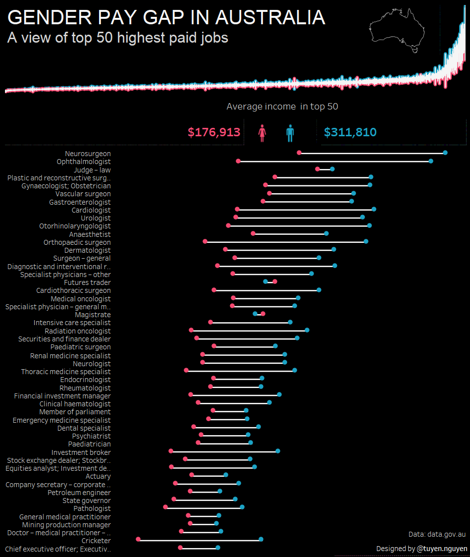
Gender Pay Gap In Australia
The dashboard reveals a significant gap in salary of men and women in Australia by showing top 50 highest paid jobs.
US vs. China - CO2 Emission Dashboard
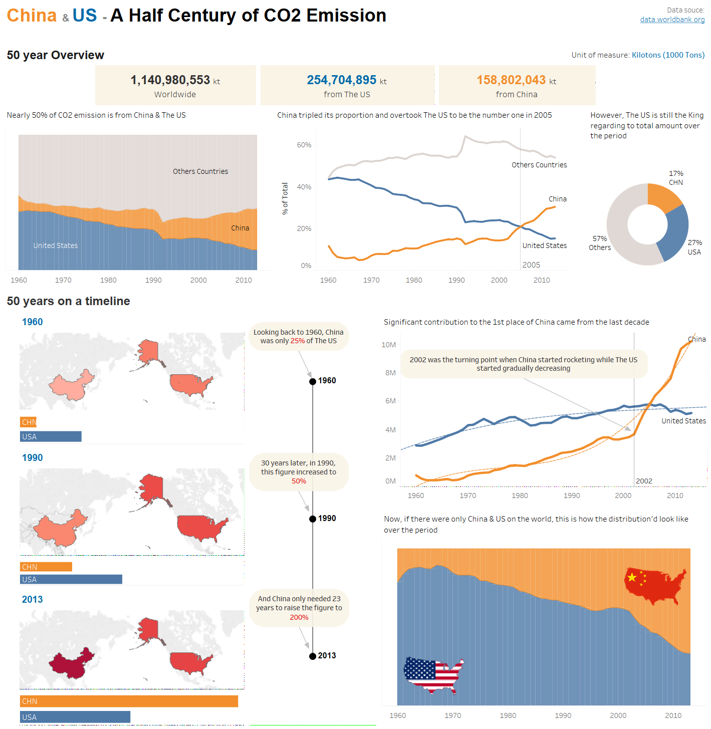
The dashboard shows the amount of C02 emission from US and China in the last 50 years. It revealed a truth that nearly 50% of CO2 emission in last 50 years has been from those 2 countries, and there's a continue growing trend in China.
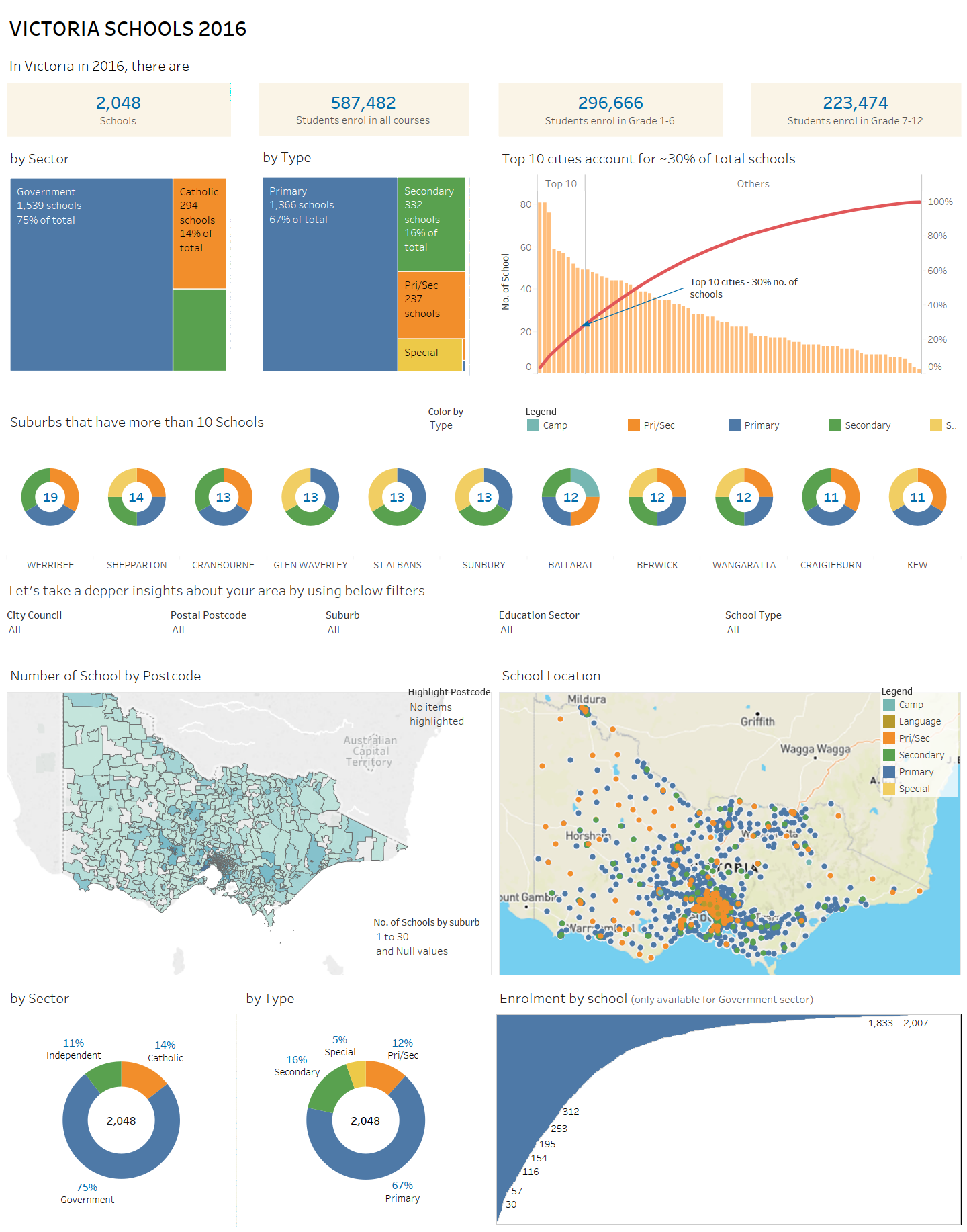
School in Victoria
The dashboard shows the distribution of school across Victoria, Australia with regards to their sectors and level of study,