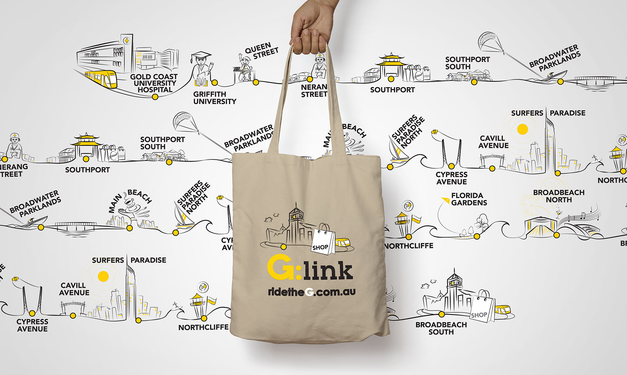
While working for Quadrant Creative, I had the opportunity to illustrate a route map for the brand new Gold Coast light rail, G-link.
All stops included elements that were relevant to the location to help people recognise the stops at a glance.
The illustration was used for route maps inside the carriages, the G-link website, billboards and promotional material.
Slide - illustration, web design
SLiDE’s multi-platform world connected with the audience via TV series, social media and web site. The TV series was was shot in Brisbane and co-produced by Hoodlum and Playmaker Media, for FOX8.
I had the opportunity of a life time to illustrate some fun characters that reflected the TV show. I loved every minute of working on this project, it’s incredibly satisfying to make people laugh.
The illustrations were used on games that were hosted on the SLiDE website to interact with viewers of the show. I also designed and illustrated the the game screens and UIs. The style combined naive vector with photographic backgrounds & the mixed-media style was continued on the website.
Pauline Harland Celebrant - Logo Design & Web Design
Gold Coast based Celebrant Pauline Harland was looking for help to get her brand out to the public in style.
The brand ended up modern and playful with paint effect breaking the heart shape. The website followed suit with a pink palette and clean design with minimal text.
paulineharlandcelebrant.com.au
Intense Initiation - Storyboard illustrations
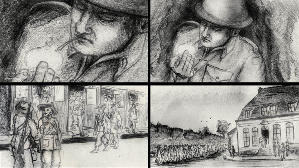
Cutting Edge needed a storyboard to convey their vision of a WW1 short film/doco.
The illustration imitates war artist style - producing quick sketches that described scenes at location.
The Strange Calls - Illustration & web design
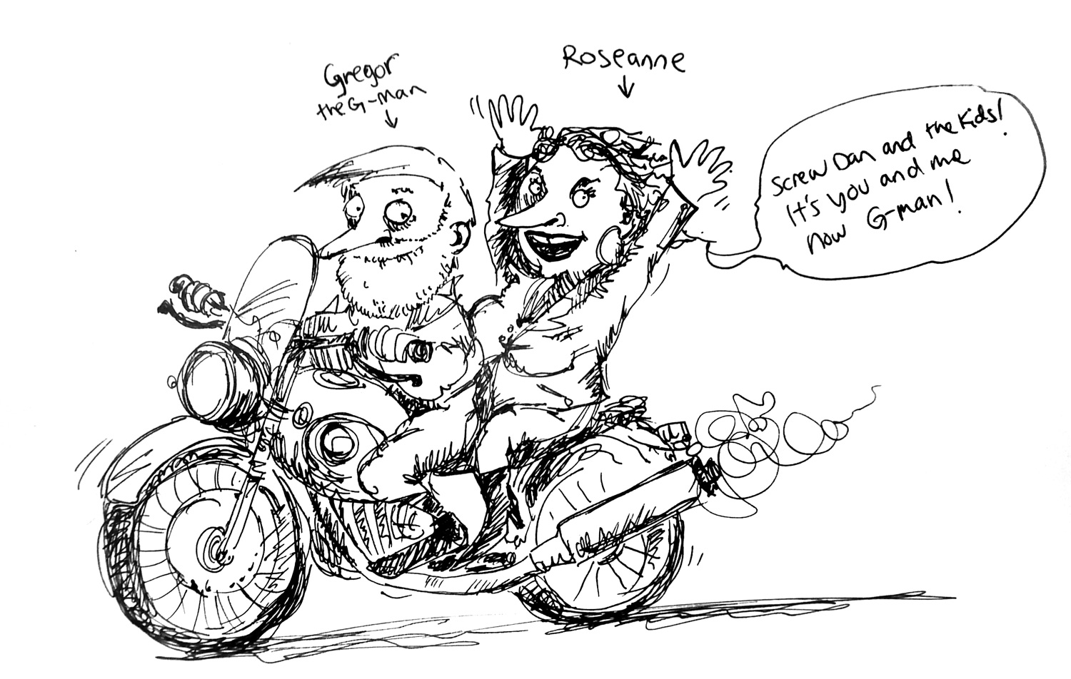
Yet another hilarious illustration project for Hoodlum. The aim of the creative was to compliment the TV series that aired on ABC 2.
The challenge was to pretend to be an older man with vivid imagination and then proceed draw some insane scenes. It’s always a great job when I get to laugh out loud when drawing. Such fantastic copy writing by Hoodlum’s creative team!
It is such a shame the website is no longer live as it was a constant source of hilarity for me as I read through Gregor’s notes and advice. The mix of bizarre and dark humour really hit the spot.
Spank Betty Records Logo, Website & illustrations
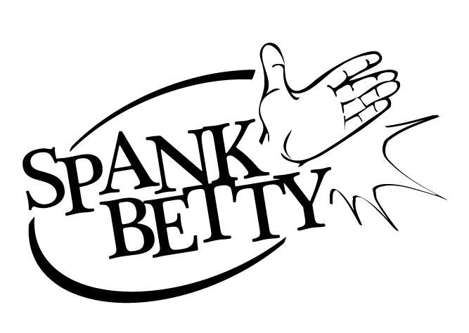
Spank Betty Records needed branding and a website to boost.
The cheeky logo reflects 50s style with a comic book style hand giving a bit of naughty but nice spanking.
I also illustrated tantalising modern era pin-up girls for the record label’s website. Oh-la-la! I built the the website with a custom CMS using simple PHP&MySQL. More at: https://eggshell.com.au/spank-betty-records/
Savage Winter - Look Book
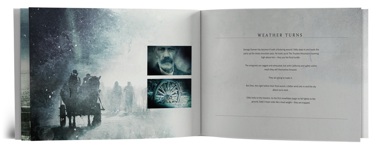
Occasionally I get to create look books to show the potential of a proposed story for film or TV. Stock and CC0 images are generally used as existing imagery is not available. Savage Winter is one of my favourite look books I’ve created for Hoodlum. The textured art style added a dreamlike quality to the grim story in the freezing cold.
Mango Bay - Branding
Gold Coast based interior designer Carol Allan runs Mangobay design and needed new branding. The logo combined mango+bay+design. Is it a mango, is it a bay or a funky 60s armchair?
Dallas Frasca - Branding, CD covers & marketing collateral
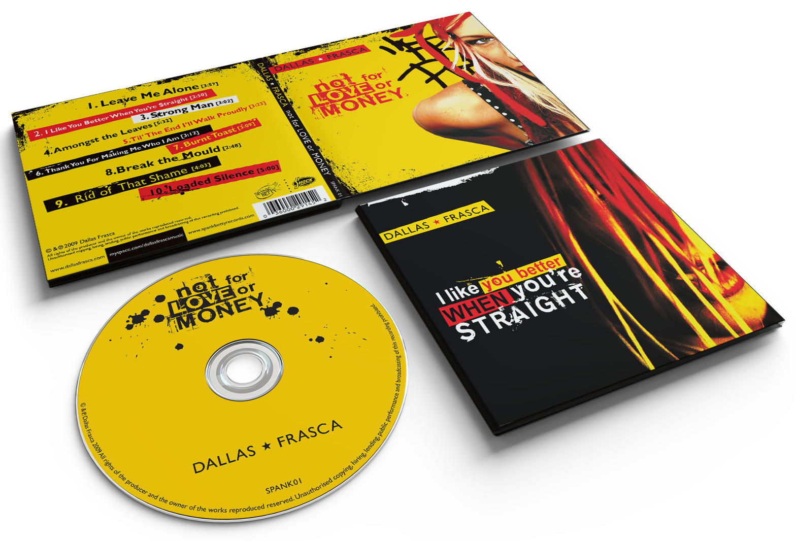
I had the honour of working with Dallas Frasca on their branding for ‘Not for Love or Money’. It was incredible to get to work with such creative bunch of artists and to create this stand out yellow set.
The lettering for the CD & EP title were a mix of street art stencils and vintage punk posters. The ‘Dallas Frasca’ name treated with simplicity, encased in contrasting colour helped it stand out despite it’s smaller size.
Extensive media campaign was launched with press ads promoting national tour dates.
Dallas Frasca is an Australian three piece rock band – Listen to them on Spotify or iTunes.
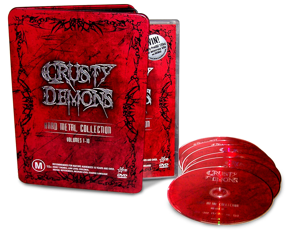
Crusty Demons - DVD tin art
The design for this special edition tin involved a lot of trust in the manufacturer to follow the finished art to tee. Tin was embossed with the logo and opaque colour applied everywhere else except the title. Came back from the manufacturer just right, luckily I was able to get a sample.
Soap Star Game Inventory illustrations
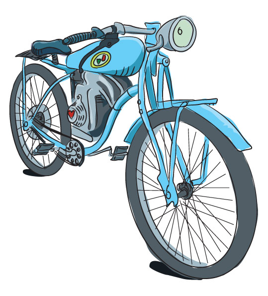
Soapstar was an innovative Facebook role playing game by Hoodlum. Participants could play roles in a soap to survive hilarious plots.
The mechanics of the game used icons to express the mood of the responses where mere words wouldn’t do. I came up with simple icons that would be easy to identify even at a small size.
I also illustrated inventory items for all the possible things a soap star could possibly want. Players could upgrade their characters by buying clothes, houses, trinkets and such.